
Guides
Modern Bento Grid Layouts for SaaS Dashboards and AI Interfaces
Learn how modern SaaS products, AI interfaces, and analytics dashboards use Bento Grid systems to create modular responsive layouts. Explore frontend workflow strategies, Tailwind composition techniques, and browser-native Bento planning with SHRTX.
Modern Bento Grid Layouts for SaaS Dashboards and AI Interfaces
Learn how modern SaaS products, AI interfaces, and analytics dashboards use Bento Grid systems to create modular responsive layouts. Explore frontend workflow strategies, Tailwind composition techniques, and browser-native Bento planning with SHRTX.
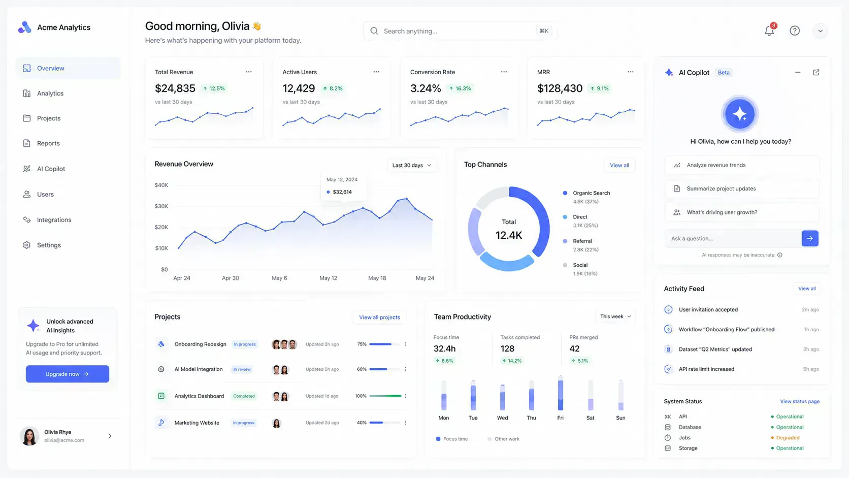
Modern product interfaces have started to feel more modular. Analytics platforms group charts, KPIs, and alerts into clear cards. AI apps place prompts, outputs, examples, and model state side by side. Admin panels arrange queues, filters, activity logs, and actions so operators can scan the surface without reading it like a report.
That visual shift is more than a style preference. Product teams moved toward card-based surfaces because modern tools have to show mixed information without overwhelming the viewport. When every card competes equally, dashboards become harder to scan even if they look organized. The layout has to keep AI workflows focused and let modular admin surfaces adapt when content density changes.
Bento grid layouts emerged as one practical way to structure those increasingly modular product surfaces. They turn recognizable dashboard cards and product modules into a responsive composition system where teams can assign visual priority, spans, and scanning order before implementation. This guide explains how bento grids work as frontend layout systems, with responsive hierarchy, Tailwind grid composition, dashboard card planning, AI product surfaces, asset payload checks, and browser-native viewport iteration with the Bento Grid Generator before production Tailwind implementation.
Quick Answer
A bento grid is a modular card layout where interface regions use different column and row spans inside a shared grid. The pattern works well for SaaS dashboards and AI interfaces because it supports mixed content density without forcing every module into the same visual weight.
For production work, the useful question is not whether a grid looks modern. The useful question is whether the layout preserves hierarchy across desktop, tablet, and mobile. A strong bento workflow validates card order, span behavior, breakpoints, gaps, payload weight, and export structure before the layout enters a component system.
What a Bento Grid Means in Product Interfaces
The term comes from bento lunchboxes, where separate compartments keep different items organized inside one tray. In UI work, the idea maps cleanly to modular product surfaces. Each region has its own boundary, but the whole layout still reads as one coordinated interface.
That matters because modern product interfaces combine content types. A dashboard card might contain a metric, a chart, a status label, an empty state, or a workflow action. A bento grid gives those modules a shared spatial system so the interface does not feel like a pile of unrelated panels.
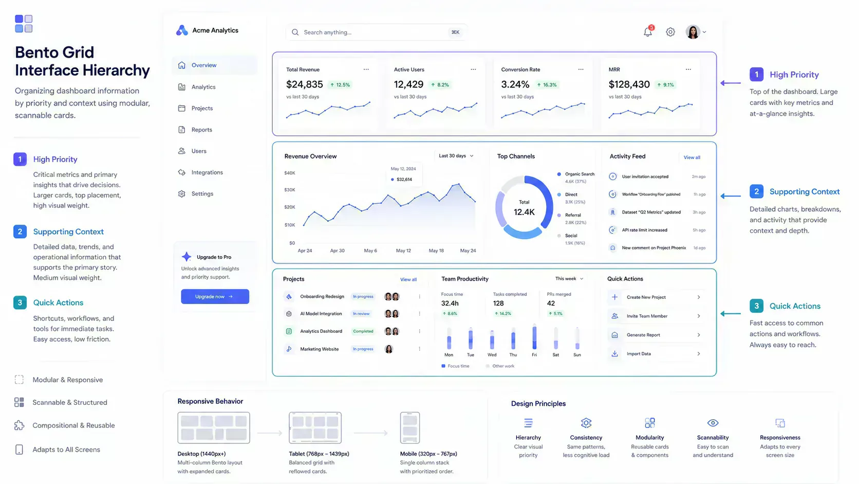
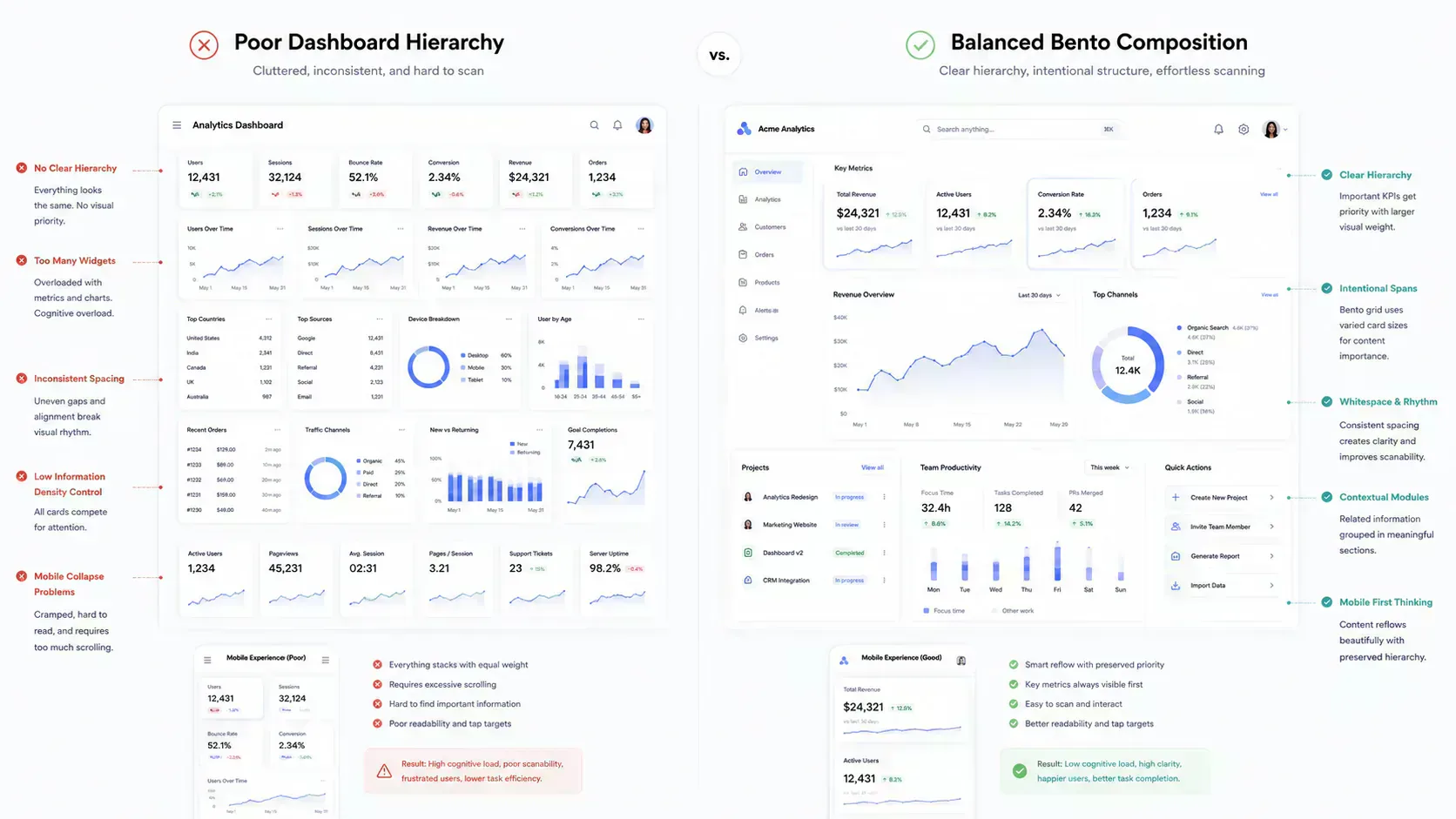
A basic card grid gives every item the same weight. A bento grid gives the interface a hierarchy:
- Larger regions for primary decisions, hero metrics, model output, or the main chart.
- Medium regions for supporting analytics, onboarding steps, or feature groups.
- Small regions for secondary indicators, status tiles, shortcuts, and metadata.
The result is controlled hierarchy, not visual variation alone. Frontend teams can prioritize actions, analytics, onboarding flows, and high-priority workflow regions across responsive surfaces.
Why Frontend Teams Use Bento Systems Operationally
The bento pattern became popular because it is scannable, but frontend teams keep using it because it fits real product constraints. A dashboard usually needs dense information without forcing users into a long vertical report. A bento layout can show relationships between modules while still preserving separation, which matters when product managers keep adding states to the same surface.
The operational benefits are practical:
- Hierarchy control: primary product signals can be larger without moving everything into a single hero section.
- Responsive density: the same module set can shift from four columns to two columns to one column.
- Modular scaling: teams can add or remove cards while preserving a grid contract.
- Mixed media handling: charts, text, screenshots, videos, and controls can sit together without losing boundaries.
- Frontend iteration speed: layout decisions can be tested before component implementation.
This is why bento grids fit analytics dashboards, AI copilots, product landing systems, documentation hubs, and admin surfaces. The pattern gives teams a way to model interface priority before writing the final JSX.
Bento Layouts, Density, and Scanning Cost
Bento grids work because users scan interfaces in chunks, but the frontend consequence is density management. Each card becomes a decision region with its own purpose. A user can read a revenue metric, compare a chart, then inspect a task feed without treating the whole screen as one uninterrupted report.
The risk is that teams confuse chunking with fragmentation. A dashboard with too many small cards does not become easier to scan. It becomes a surface where every region asks for attention and no region clearly wins.
The implementation rule is practical. If two controls belong to the same decision, they should usually live inside the same card. If two signals compete for attention, their spans and placement should make that conflict visible during layout planning.
Good bento systems use three principles:
- Proximity: related metrics, labels, and actions stay inside the same module.
- Similarity: cards share spacing, radius, border, and type rhythm so the surface feels coherent.
- Priority: card size and order communicate which regions matter first.
This is where bento layouts become frontend architecture, not decoration.
The Anatomy of a Production Bento Grid
A production bento grid needs a predictable grid model. The exact numbers depend on the interface, but most systems start with columns, gaps, row behavior, and span rules.
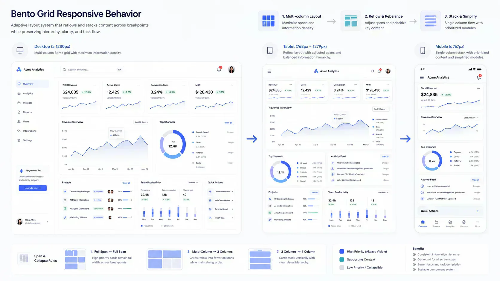
For a SaaS dashboard, a common desktop model is four columns. For tablet, two columns often gives better readability. For mobile, one column is usually the stable baseline.
<section className="grid grid-cols-1 gap-4 md:grid-cols-2 md:gap-5 lg:grid-cols-4 lg:gap-6">
  <article className="rounded-lg border p-5 md:col-span-2 lg:col-span-2 lg:row-span-2">
    <h2>Revenue Overview</h2>
  </article>

  <article className="rounded-lg border p-5">
    <h2>Active Users</h2>
  </article>

  <article className="rounded-lg border p-5">
    <h2>Conversion</h2>
  </article>

  <article className="rounded-lg border p-5 md:col-span-2">
    <h2>Activity Feed</h2>
  </article>
</section>
This is a small example, but it shows the core contract:
grid-cols-1keeps mobile predictable.md:grid-cols-2gives tablet enough structure without overcrowding.lg:grid-cols-4supports desktop density.md:col-span-2andlg:row-span-2define hierarchy at specific breakpoints.
The implementation issue is not syntax. The issue is deciding which modules deserve larger spans at each viewport.
Tailwind Span Orchestration
Tailwind makes bento grids fast to implement because grid columns, gaps, spans, and breakpoints are visible in the markup. That visibility helps teams review layout behavior during code review.
For bento work, the most important utilities are:
grid,grid-cols-*, and responsive column variants.gap-*,md:gap-*, andlg:gap-*for consistent gutters.col-span-*and responsive span overrides.row-span-*when vertical emphasis matters.auto-rows-*or fixed min-height utilities when cards need consistent rhythm.order-*only when the source order needs careful responsive adjustment.
The main mistake is treating spans as decoration. A span should answer a product question. Which region is primary. Which region supports a decision. Which region can collapse earlier. Which region should stay readable on tablet.
If those answers are not clear, the layout is not ready for implementation.
This also affects component-system maintenance. If every card defines its own span rules locally, the grid becomes hard to reason about after a few releases. Treat spans as layout variants tied to module types, not one-off class strings added during visual cleanup.
Responsive Breakpoint Balancing
Desktop bento grids are easy to overfit. A four-column layout can look balanced in a design screenshot, then become cramped on tablet and noisy on mobile. Responsive validation is where the pattern either becomes useful or becomes fragile.
Use this breakpoint checklist before shipping a bento layout:
- On mobile, does the first card still match the user's likely intent.
- On tablet, does a large hero card consume too much vertical space.
- On desktop, do small cards become isolated under oversized regions.
- Do chart cards keep enough width for labels and axes.
- Do KPI cards stay comparable when they wrap.
- Do CTA cards appear after enough context, not before it.
- Do long headings and filenames stay inside their cards.
The Bento Grid Generator is useful for this stage because it lets you preview mobile, tablet, and desktop structure before copying Tailwind or React code. That is the right place to catch hierarchy failures, not after the layout is already wired into a dashboard route.
SaaS Dashboard Layout Patterns
A SaaS dashboard usually has repeatable module types. Once those modules are named, bento planning becomes easier because each card has a job.
Common modules include:
- Dashboard header: account context, filters, date range, or primary action.
- KPI row: revenue, usage, conversion, churn, latency, or error rate.
- Primary analytics panel: the main chart or decision surface.
- Secondary analytics cluster: segmented charts, cohort tables, or comparison cards.
- Activity feed: recent events, alerts, or operational history.
- Sidebar region: navigation, filters, saved views, or workspace metadata.
- CTA region: upgrade prompt, onboarding task, or next recommended action.
A bento system should not force all of these into equal cards. The primary analytics panel usually needs a wider span. KPI modules need consistency. Activity feeds need vertical room. CTA cards should be visible but not louder than the user's main operational task.
That is the difference between a dashboard that looks assembled and a dashboard that feels planned.
AI Interface Layouts
AI products often combine input, output, context, examples, and operational state. That makes them a strong fit for bento layout systems.
An AI interface may include:
- Prompt or instruction input.
- Model response preview.
- Token, latency, or cost indicators.
- Example prompts or templates.
- Evaluation results.
- File upload or source context panels.
- Safety notes, version settings, or deployment status.
The layout challenge is priority under pressure. The prompt area and response area usually need primary placement. Metrics help users understand cost and performance, but they should not dominate the surface. Examples and onboarding can use smaller modules until the user needs them.
For AI dashboards, avoid turning every card into a metric tile. The most useful bento layouts separate decision modules from supporting context. If the product includes app handoff or mobile onboarding, route-specific cards should also be tested with Deep Link Builder so dashboard links do not lose destination intent outside the desktop web surface.
Admin Panels and Internal Tools
Admin interfaces often fail because they expose every control with the same visual weight. A bento layout can improve this by grouping operational tasks into modules.
For example, an admin surface might use:
- A large moderation queue or review panel.
- Smaller status cards for open reports, failed jobs, and pending approvals.
- A wide activity log for audit review.
- A compact sidebar for filters or saved segments.
- A CTA card for the next operational action.
The grid should reflect workflow order. Operators need the current problem first, then context, then actions. A visually balanced grid that buries the action sequence is not operationally balanced.
Landing Pages and Modular Product Storytelling
Bento grids also work on product landing pages, but the job changes. A dashboard bento grid supports repeated operational use. A landing page bento grid supports explanation and evaluation.
Use larger modules for product proof, screenshots, or the main value proposition. Use smaller modules for integrations, security notes, platform support, and feature details. Keep the number of modules controlled so the page does not become a wall of equal cards.
For landing systems, visual assets matter. Before placing screenshots or media-heavy cards, inspect dimensions with Image Dimension Checker, reduce heavy files with Image Compressor, and test WebP output with Image to WebP Converter. A bento layout can make a product page feel organized, but oversized media can still hurt loading behavior and make responsive cards resize unpredictably.
Asset Payload and Layout Performance
Bento layouts often invite rich media: screenshots, gradients, product previews, icons, chart images, and background treatments. That creates a payload problem. A polished layout can become slow if every card contains an oversized asset.
Before shipping a media-heavy bento surface:
- Check total upload and page asset weight with File Size Analyzer before screenshots or demo assets enter the page.
- Compress product screenshots before placing them inside dashboard or landing cards.
- Convert appropriate PNG or JPEG assets to WebP before publishing card-heavy surfaces.
- Normalize filenames with Filename Normalizer before adding exported batches to a repo or CMS.
- Keep card imagery aligned to real display dimensions.
Layout structure and asset workflow are connected. A bento grid that depends on eight large screenshots should be planned with payload constraints from the start. Otherwise the grid looks balanced in design review but feels heavy when routed through a real product page.
Color, Gradients, and Visual Systems
Bento grids need visual consistency because the layout already contains asymmetry. If every card uses a different visual treatment, the surface becomes noisy.
Start with a restrained palette. Use Tailwind Palette Creator when you need implementation-ready color tokens, or Image Palette Generator when product imagery should influence the palette. Use CSS Gradient Generator for controlled gradient utilities, not as a substitute for layout hierarchy.
The practical rule is operational. Color should clarify grouping and state. It should not compensate for weak span decisions.
Tool-Assisted Bento Planning
Hand-coding a bento grid is manageable once the hierarchy is settled. The difficult part is deciding the hierarchy, testing breakpoints, and exporting a structure that does not collapse badly.
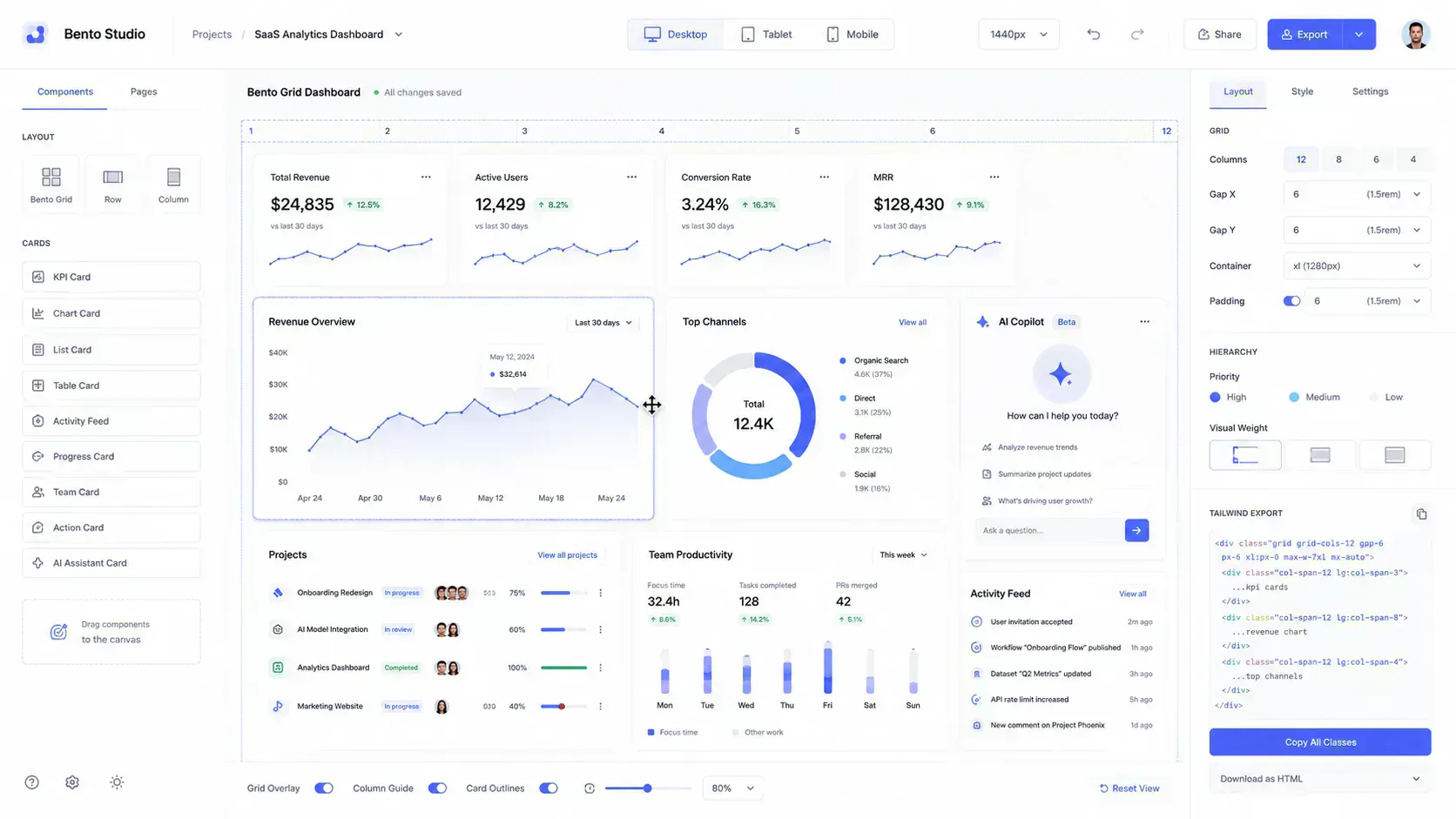
The Bento Grid Generator is built around that planning workflow:
- Choose a dashboard, analytics, sidebar, marketing, or asymmetrical layout mode.
- Set mobile, tablet, and desktop column behavior.
- Assign module types such as hero, KPI, analytics, sidebar, pricing, feed, or CTA.
- Preview responsive stacking before export.
- Copy Tailwind, React JSX, or CSS Grid output as a starting point.
Use it before implementation when the team is still deciding how the surface should behave. Use it after implementation when the card order or spans feel wrong but the underlying module set is still valid.
A Practical Bento Planning Workflow
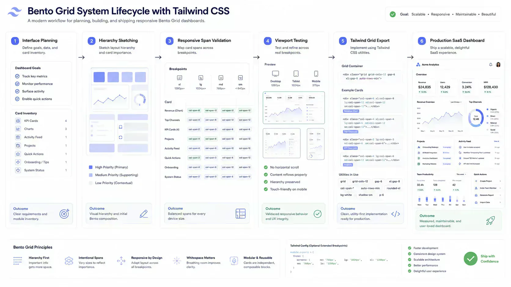
Use this workflow before building a production dashboard or AI product surface.
- List modules by job, not by visual style.
- Mark primary, secondary, and supporting modules.
- Choose a mobile-first source order.
- Define mobile, tablet, and desktop column counts.
- Assign spans only where hierarchy requires them.
- Preview collapse behavior at each breakpoint.
- Check image and media payload weight.
- Export the layout structure.
- Implement cards as reusable components.
- Revalidate with real content, long labels, empty states, and loading states.
This order prevents a common failure mode: designing a desktop grid first, then trying to rescue it with responsive overrides.
Why Most Bento Dashboards Fail
Most weak bento layouts fail for operational reasons, not aesthetic reasons. The design may look balanced in a static mockup, but the product surface breaks once real data, long labels, async states, screenshots, and mobile collapse behavior enter the system.
Every Card Competes Equally
Equal-weight cards create dashboard fatigue. If every card has the same size, same contrast, and same density, the user has to perform the prioritization manually. A bento dashboard should make the next decision easier, not convert the viewport into a checklist of unrelated panels.
The fix is hierarchy before styling. Give primary decisions more space, group secondary signals, and let supporting cards stay visibly subordinate.
Oversized Hero Cards on Tablet
A large desktop hero card may become too tall on tablet. This is especially common with analytics panels and product screenshots. Test tablet early and reduce spans when the primary card starts pushing useful context too far down.
Unreadable Mobile Collapse
Mobile collapse exposes weak source order. A desktop layout can hide poor sequencing because the eye can scan across rows, but mobile forces a single path. If the first three cards are decorative, secondary, or operationally low priority, the mobile dashboard is already failing.
The fix is to choose mobile order before desktop decoration. Start with the user's likely task, then add context and supporting modules.
Inconsistent Span Logic
Inconsistent spans are a maintenance problem. One card becomes wide because it looked good in a design pass, another becomes tall because a chart needed room, and a third breaks because its content changed after release. Over time the grid stops expressing product priority and starts reflecting historical accidents.
The fix is to define span rules by module type. KPI cards follow one pattern, primary analytics panels follow another, activity feeds follow another, and CTA regions get explicit constraints.
Too Many KPI Regions
KPI cards are useful when they summarize the state of a system. They become noise when every metric gets promoted to the same level. A dashboard with eight KPI cards often forces users to compare numbers that do not belong in the same decision.
The fix is to separate operational indicators from diagnostic detail. Keep the primary metrics visible, then move supporting metrics into grouped modules or drill-down surfaces.
Fragmented Onboarding Surfaces
Product onboarding often gets fragmented into welcome cards, checklist cards, empty-state cards, upgrade cards, and documentation cards. In a bento layout, that can create five competing ways to start. The user sees activity, but not direction.
The fix is to make onboarding a coordinated module system. If onboarding depends on app routes, trial flows, or mobile handoff, test the destination links with Deep Link Builder before those cards ship.
Weak Spacing Rhythm
Weak spacing rhythm makes asymmetry feel accidental. If outer gaps, internal padding, chart margins, and card headers all use different rhythms, the grid stops behaving like a system. This usually appears after several teams add cards to the same dashboard without shared layout constraints.
The fix is to treat spacing as part of the component contract. Card padding, grid gaps, heading offsets, and media frames should be standardized before individual modules start adding exceptions.
Analytics and Actions Fight for Priority
Dashboards often mix analysis and action in the same viewport. A chart may need space for interpretation, while a CTA or operational action needs enough visibility to move the workflow forward. If both receive hero treatment, the interface creates a priority conflict instead of a decision path.
The fix is to decide whether the surface is primarily diagnostic or action-oriented. Diagnostic dashboards should make analysis dominant. Workflow dashboards should make the next operational action clear after enough context is visible.
Visual Effects Replacing Structure
Gradients, shadows, blur, and borders can polish a layout. They cannot create hierarchy by themselves. If the grid only works because a card has a louder background, the span system probably needs revision.
Payload Blindness
Media-heavy bento cards can hide performance issues. Treat image size, format, and dimensions as part of the layout workflow. The browser still has to load every asset inside the grid.
Use File Size Analyzer, Image Compressor, and Image to WebP Converter before the visual system becomes locked. Performance should not be an afterthought attached to a finished layout.
When Not to Use a Bento Grid
Bento grids are not the right answer for every page. A legal document, long tutorial, changelog, pricing table, or dense data table may need a simpler linear structure.
Avoid bento layouts when:
- The user needs uninterrupted reading.
- Every item has equal importance.
- The main interaction is table comparison.
- Cards need too much internal scrolling.
- The team cannot maintain responsive variants.
Good frontend architecture includes restraint. Use a bento grid when modular hierarchy helps the workflow. Do not use it just because the pattern is current.
Production Checklist
Before shipping a bento dashboard, review these items:
- Source order works on mobile.
- Tablet layout has clear hierarchy.
- Desktop layout avoids isolated tiny cards.
- Gaps and internal padding follow a consistent rhythm.
- Cards support loading, empty, and error states.
- Images are compressed and sized for display.
- Exported Tailwind utilities are readable.
- React components separate data from presentation.
- Dark mode contrast is checked.
- Keyboard focus states remain visible inside cards.
This checklist keeps the layout connected to real implementation quality.
Final Takeaway
Bento grids are not just card arrangements. In modern product interfaces, they are a way to express information hierarchy, responsive density, and modular system design through layout.
The strongest bento grids are planned like frontend workflows. They start with module purpose, validate breakpoint behavior, account for asset payload, and produce code that a component system can maintain. That is why the pattern fits SaaS dashboards, analytics surfaces, AI interfaces, admin panels, and modular product pages.
The architectural lesson is that layout is not separate from operations. Hierarchy affects scanning, spans affect maintenance, collapse behavior affects mobile workflows, and media choices affect payload. Browser-native planning tools help because they let teams test those constraints before the interface becomes expensive to change.
In that workflow, the Bento Grid Generator is a planning surface for testing hierarchy, collapse behavior, and export structure before Tailwind implementation. Asset and design checks from File Size Analyzer, Image Compressor, Image to WebP Converter, Image Dimension Checker, Filename Normalizer, and Tailwind Palette Creator keep the visual system tied to production constraints. The goal is not a prettier grid. The goal is an interface system that keeps its structure as the product surface changes.
Tools Referenced By Topic
Bento Grid Generator
Create responsive bento grid layouts with Tailwind, React, and CSS Grid export.
Fluid Typography (Clamp)
Generate responsive font-size CSS using the clamp() function for seamless scaling.
CSS Shadow Generator
Visually design complex box shadows and export the CSS code for your projects.
Related Reading
May 25, 2026 • 12 min
How to Check File Size Before Uploading Files Online
Learn how to check file size before uploading files to email platforms, CMS systems, cloud storage, APIs, and messaging apps. Explore browser-native payload analysis, upload compatibility checks, transfer estimates, and file optimization workflows with SHRTX.
May 17, 2026 • 15 min
Designing Glitch Art with Browser-Native Image Workflows
Learn databending, JPEG and PNG corruption behavior, pixel-sorting pipelines, and browser-local rendering workflows for glitch art.
May 17, 2026 • 14 min
WebP Optimization and Modern Image Delivery Guide
Learn WebP workflows for faster sites with local processing, visual checks, responsive delivery, and Core Web Vitals guidance.